Have you ever walked into a room that was beautifully styled, but something wasn’t quite, right? Perhaps you’ve been investing in new furniture to create a new look at home, but it doesn’t seem to be coming together the way you had hoped? When you put it all together it just seems wrong?
Sometimes it’s not the colour choice or the style, or even the individual items included in the room that create this sense of unease. Often the issue starts with the concept of scale and proportion in the room. Homes are beautiful because of the feeling they evoke, not due to how much you’ve spent on the sofa, throws or artwork.
Your eye will know when things don’t seem right, and while this seems a ‘technical’ mathematical element to interior design or styling, it’s one that really applies to everything you put in your room, and it helps create a sense of ‘home and warmth’.
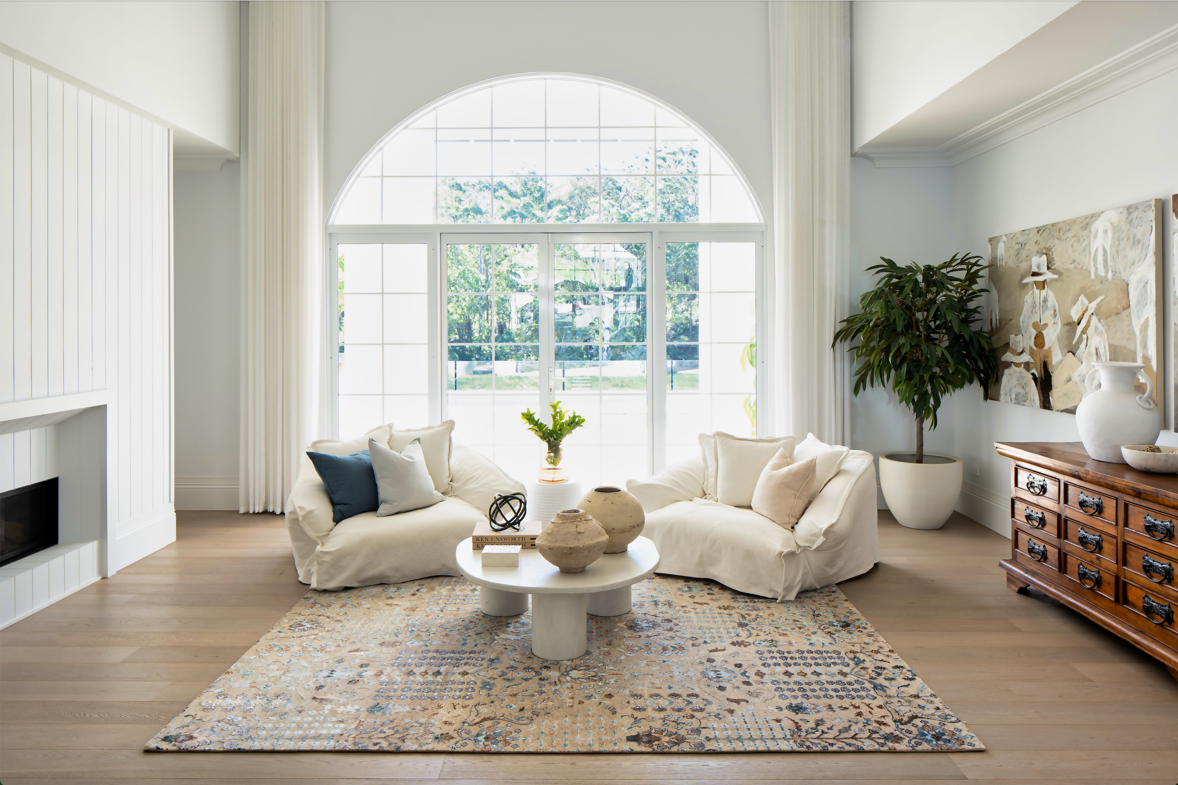
In our Block 2021 home, the most common response we had from people walking in the front room, which had soaring ceilings and open space, was that it felt ‘homely’, and yet the room was huge.
So what are we talking about and how do you consider it when you’re styling your home?
When you think about scale and proportion, it really is about how all the items fit into the space and how they fit together.
Thinking about scale starts from the beginning. For example, when you are looking at flooring, think about the width of the floorboards and how they will relate to the size of the room, or rooms, you will be decorating…will they be wide enough, or too wide for the visual impact you’re creating.
Even think about the texture and pile of carpets and rugs. How does the texture enhance the room you’re going to put it in.
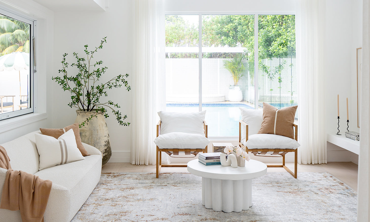
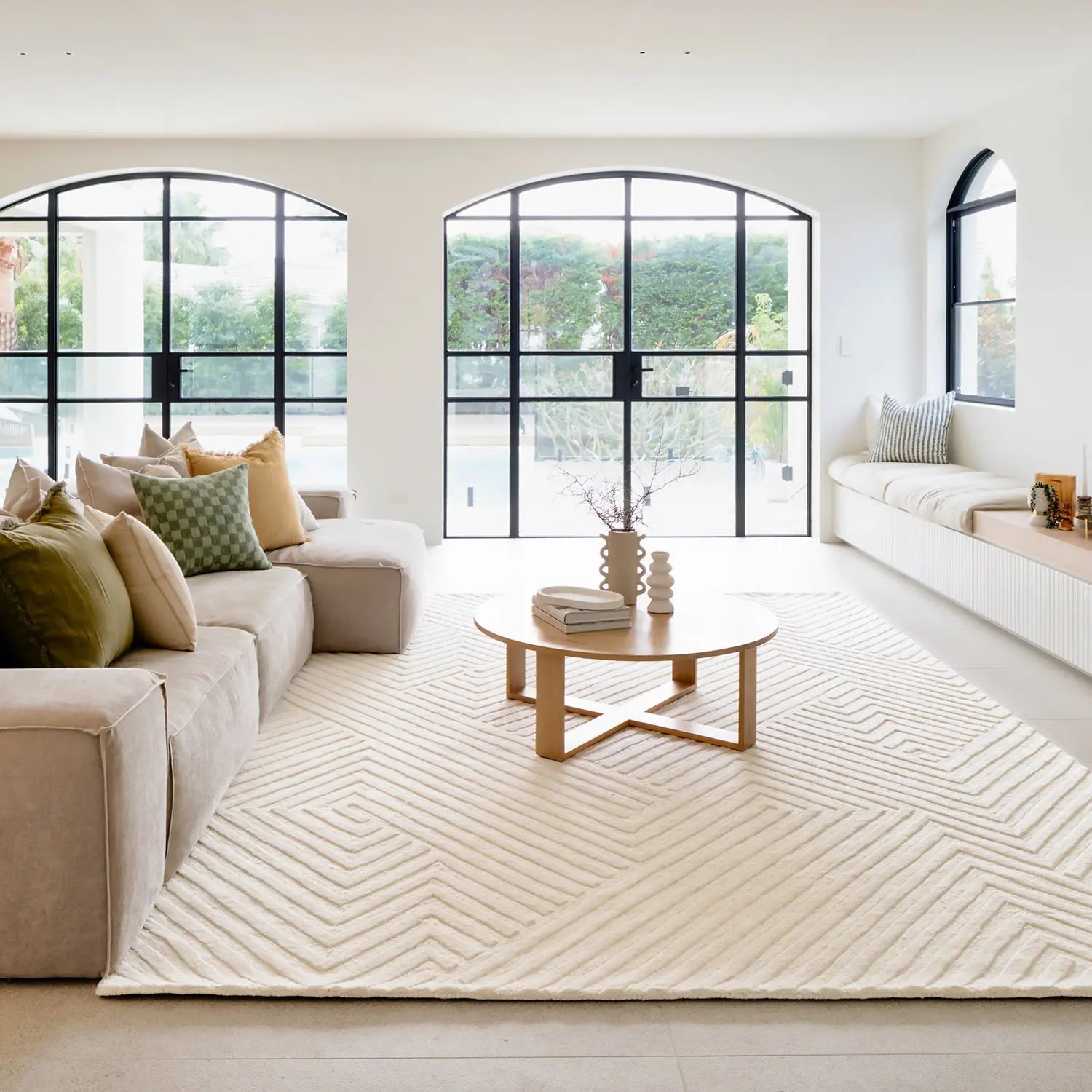
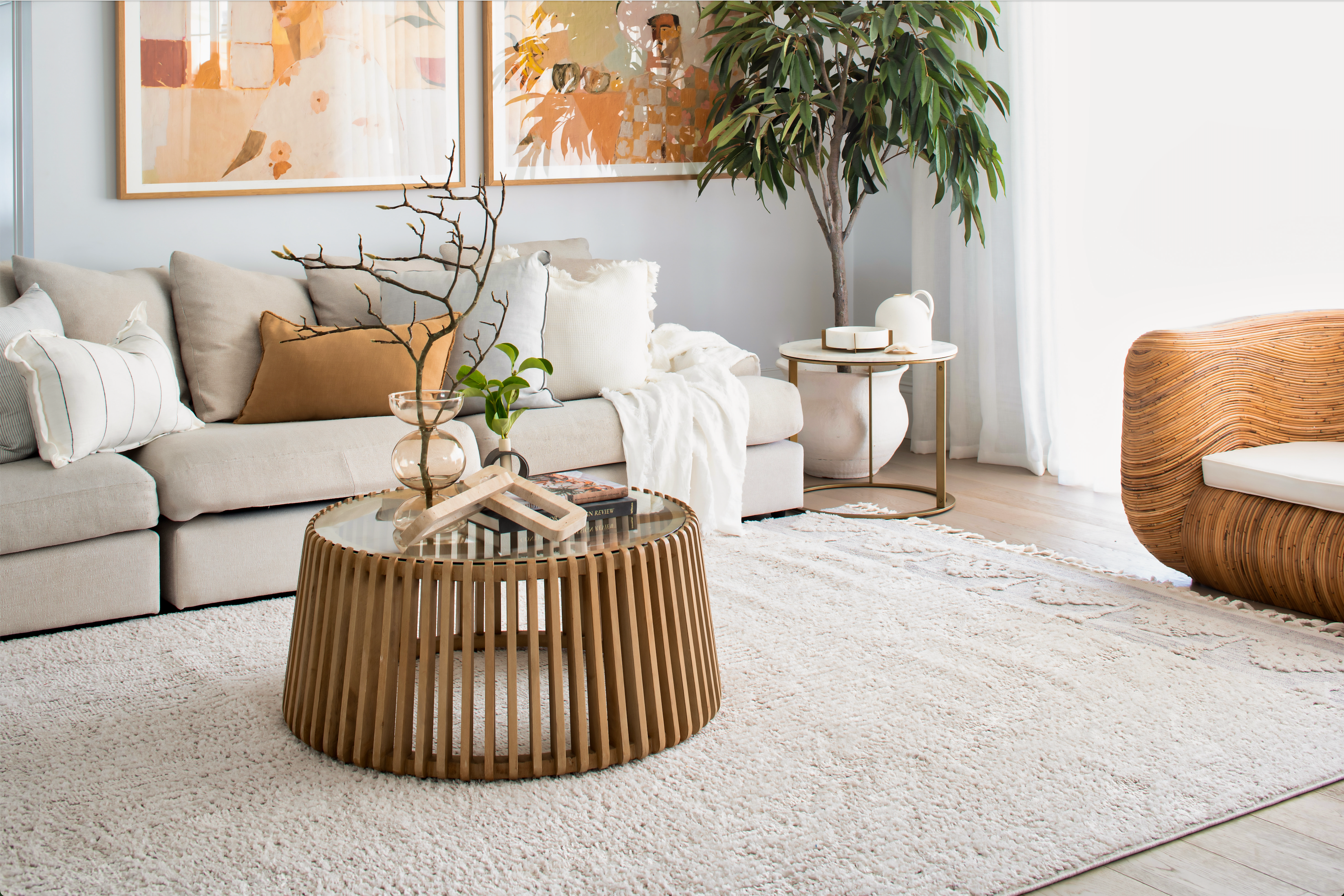
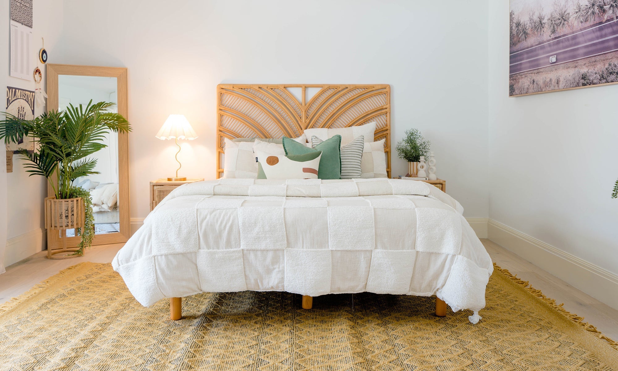
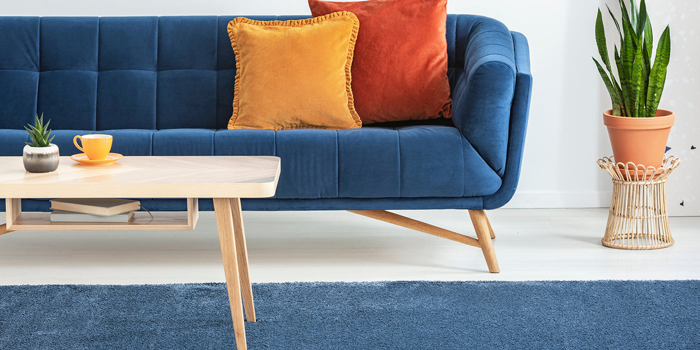
Simply put, scale is the relative size of one object compared to another, and that includes how it compares to the size of a human…. you! Think of it as the relative size of a coffee table to a sofa, or a cushion to a chair, a lamp to a bedside table, or a dining table to the dining room. If one seems too big, or small, when compared to the other, then there’s an issue with scale, and your eye will know it. The result will be a room feeling unbalanced and just wrong.
Now, this doesn’t mean you can’t play with scale, and it doesn’t mean you put tiny furniture in a tiny room, it just means you must think about the balance of all items and elements in the space.
Proportion often relates to the shape of an item and how it relates to other things in the room, but it can also relate to textures. Imagine a 3-seater sofa with a small square coffee table in front, or a round dining table with a long rectangular dish in the middle, or a round floor rug between two sofas facing each other. These probably won’t look right because they are not the correct proportion when compared to the sofa or the table. Or think about a coarse knit throw being layered with delicate linen cushions. Unless you’re very skilled it just doesn’t go.
With experience you can ‘play’ with scale and proportion in rooms to create some stunning looks, those ones that people look at and say, ‘it seems to work but I don’t know why?’, but here are some things to consider:
- The main furnishing item in the rooms will set the stage for the scale of other furnishings.
- in the living room the sofa will set the scale while the bed in the bedroom or the dining table in the dining room sets the scale.
- In any space you need to leave ‘white space’ or ‘negative space’ in a room. This is the space around and between objects in a room. Using ‘negative space’ is as important as picking your furniture, so think about this early. This includes leaving some surfaces and walls uncovered so the room doesn’t overwhelm your eye.
- Larger rooms generally handle furnishings and décor that is larger, and vice versa, however aways consider function and proportion rather than size. Think of items in relation to the other elements in the room.
- Stick with odd number groupings such as three or five and vary the height to created tiered patterns.
Take a good, long walk throughout the rooms of your home. If something doesn’t feel right, it probably doesn’t have the correct scale or proportion for the space. Rearrange it, remove it or replace it until you achieve the room—and the home—that you desire.
Nail scale and proportion and your home will feel just right.
Styling with Mitch and Mark – We love colour…
Styling with Mitch and Mark – We love colour…