If you’re a lover of colour, bold or subtle, we say celebrate it with passion in your home.
Just like putting an outfit together, the colours in your home décor need to have a connection with an overall story. Everything doesn’t need to feel matchy, but it’s important that you make connecting links to bring it all together with purpose.
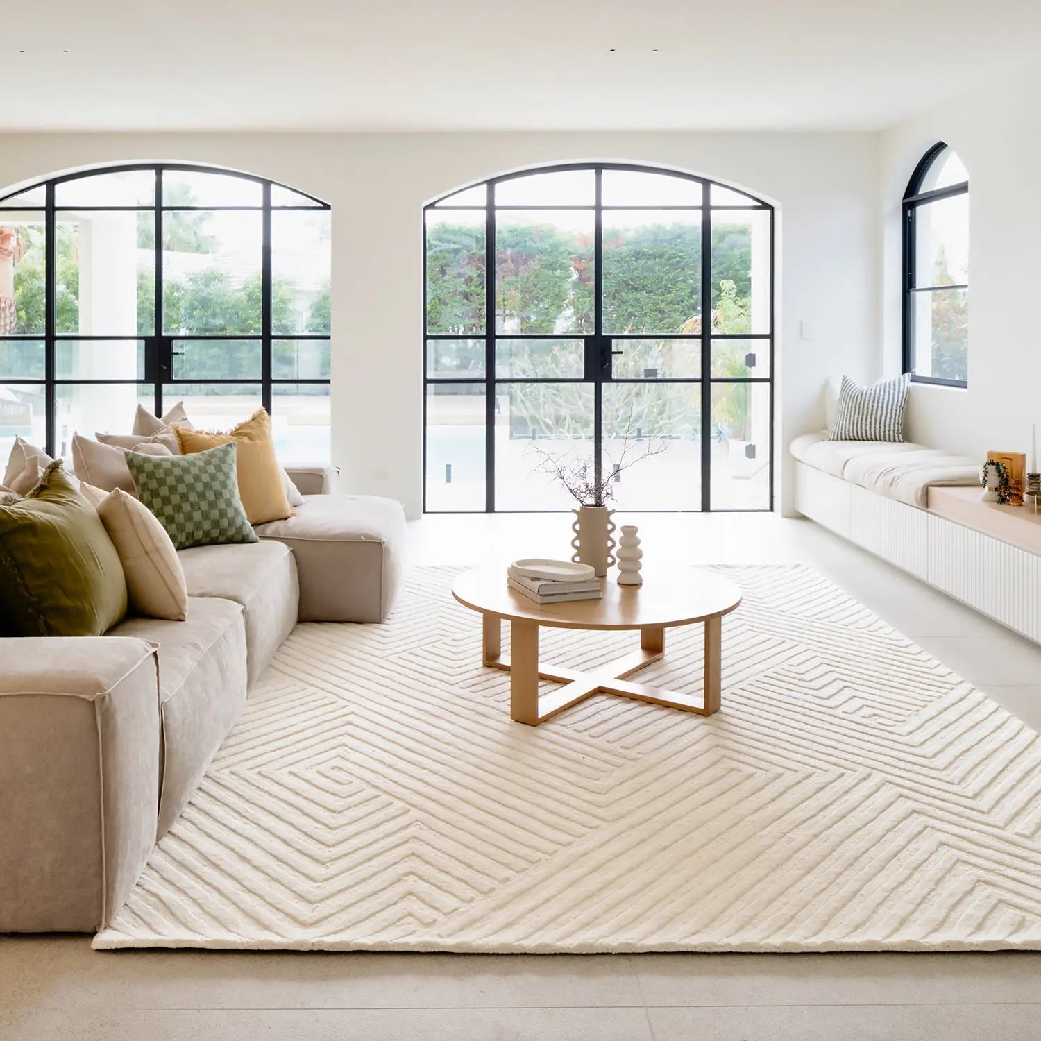
In your home you can bring in colour through layers. We know there is great benefit in going subtle with your major furnishing pieces, the expensive ones. Ensuring a neutral base through your sofa, chairs and other solid furniture pieces provides you lots of opportunity to change things up using decor pieces reflecting seasons or new trends.
Make sure you think through your neutral base colour of your major furnishings, because some neutrals throw grey, some blue and some brown tones, which may limit your hero pieces and styling choices. You also want to ensure they will withstand trends and be adaptable to a broad range of colour schemes that come and go with changes in fashions and trends. However, if you have your heart set on a statement couch, we say ‘go for it’, just remember you will likely need to live with it for a long time.
We think there are a few factors to consider when brining colour into your home. First – will the colours make you happy.
Too many designers/stylists tell people what they should be doing without considering what works for the client. It is your home, so the colour palette needs to be your inspiration, and not the inspiration of someone else who won’t be living with it day by day.
Where do you start? For a colour theme think of the hero piece you have in your room, which may be a rug or even a piece of artwork. The rug or the artwork will provide the colour inspirations to tie in or at least be complementary to the overall colour scheme. If either of these major items don’t have links to your colour scheme, they will feel disconnected and throw out the colour balance of the space.
Think about your environment when it comes to your interior colour scheme.
If you’re lucky to have a view of the ocean, bushland, rolling hills or even a city scape, the colours from these views should be on your consideration list, linking your interior to the exterior.
Here’s and example to explain how we bring colours together, and hopefully it helps this make sense.
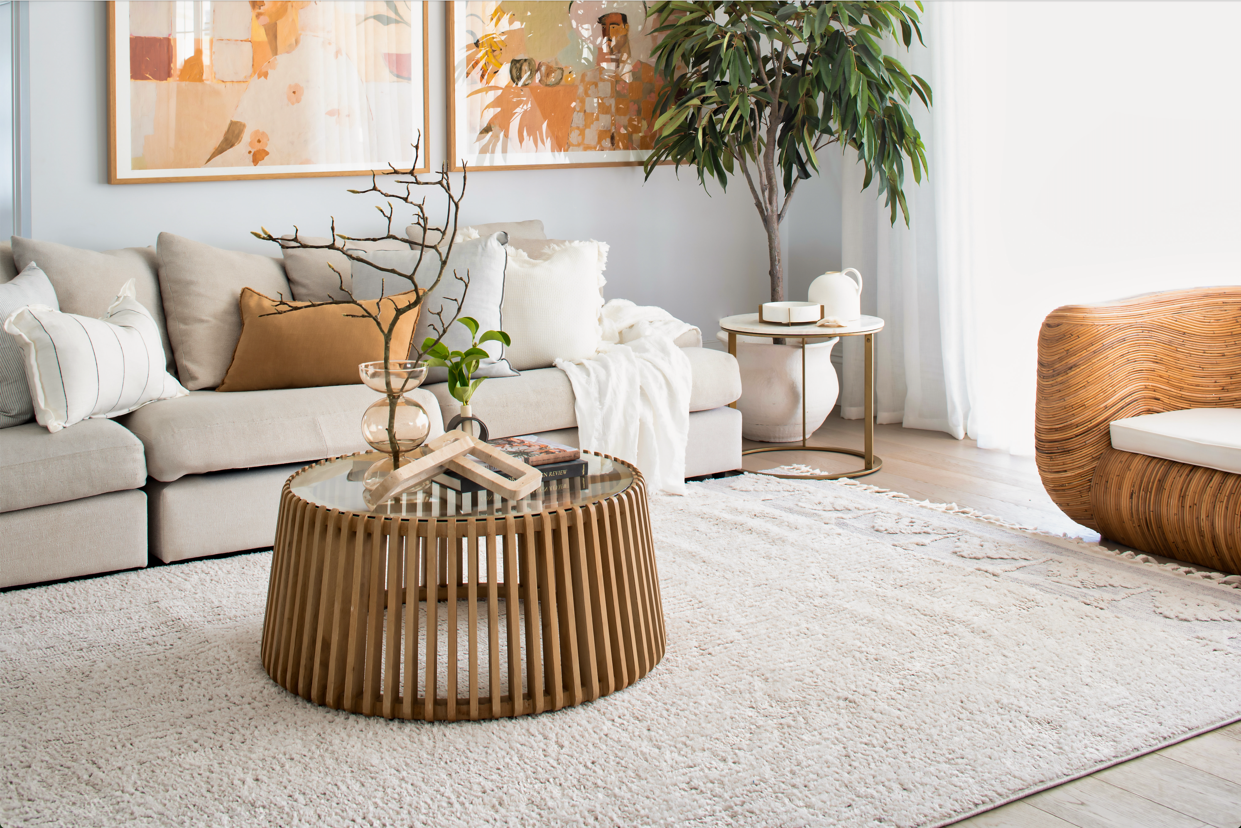
Let’s set say we are working with a living room with timber floors, a natural beige coloured couch, similar armchairs and a timber coffee table and side tables…a very neutral base palate. With this base the colour scheme options are endless and up to you. Whether you are adding a combination of green, orange, and yellow, or pink, blue and red, or anything for that matter, a few simple steps will get you where you need to be.
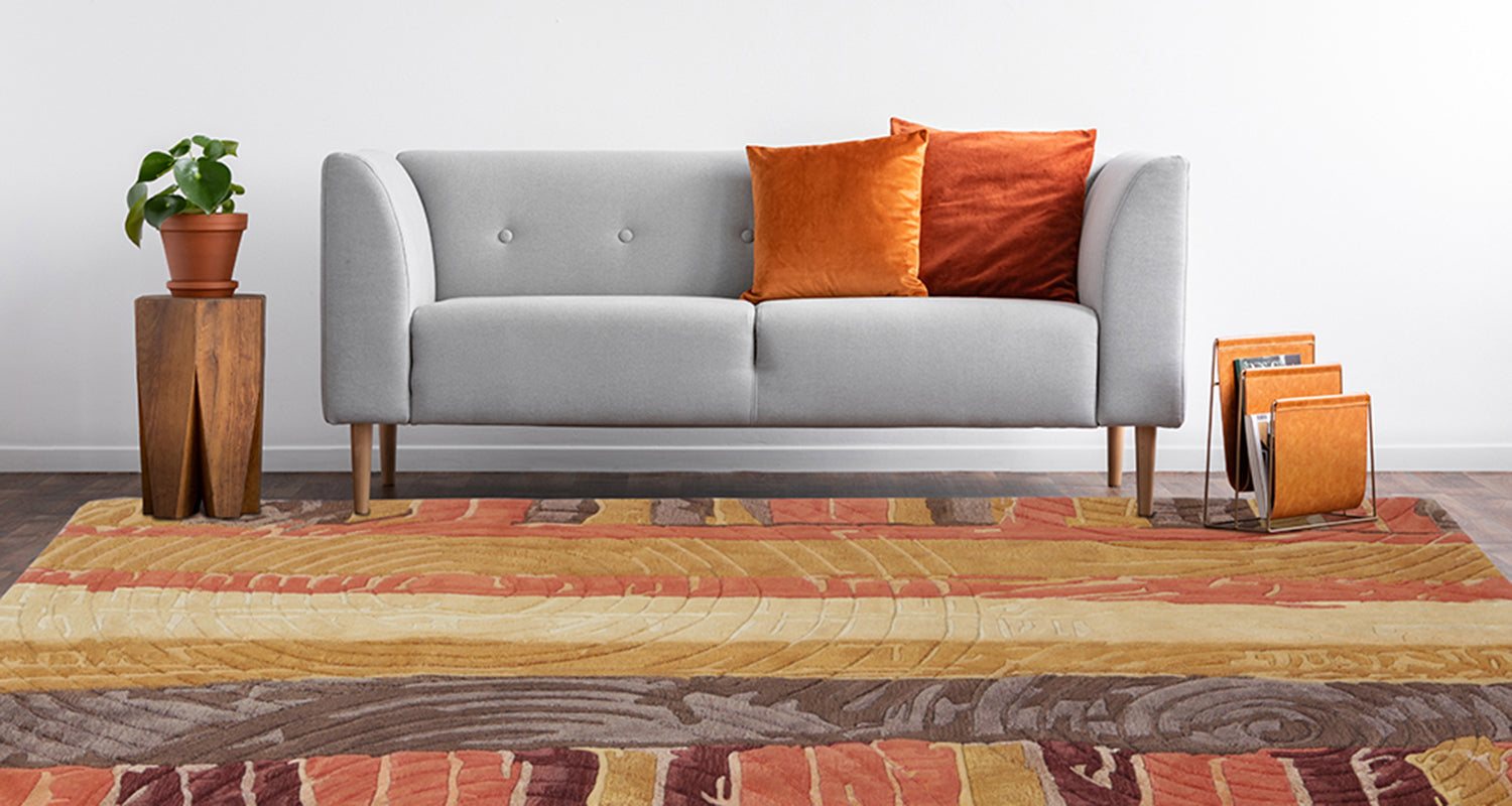
The principles we live by with any colour scheme are always the same…. colour repetition. It can be as bold or subtle as you like but has to be enough to tie the elements together. If there are two, three or more feature colours that could come from an artwork, rug or even that view, draw them out by using them in the room at least three times, either as block colour or featured in patterned furnishings.
Let’s head back to our neutral room. If we’re working with an amazing artwork that features pastel pink, sage green and rust, to bring the artwork and the room together we need to tie these colours in.
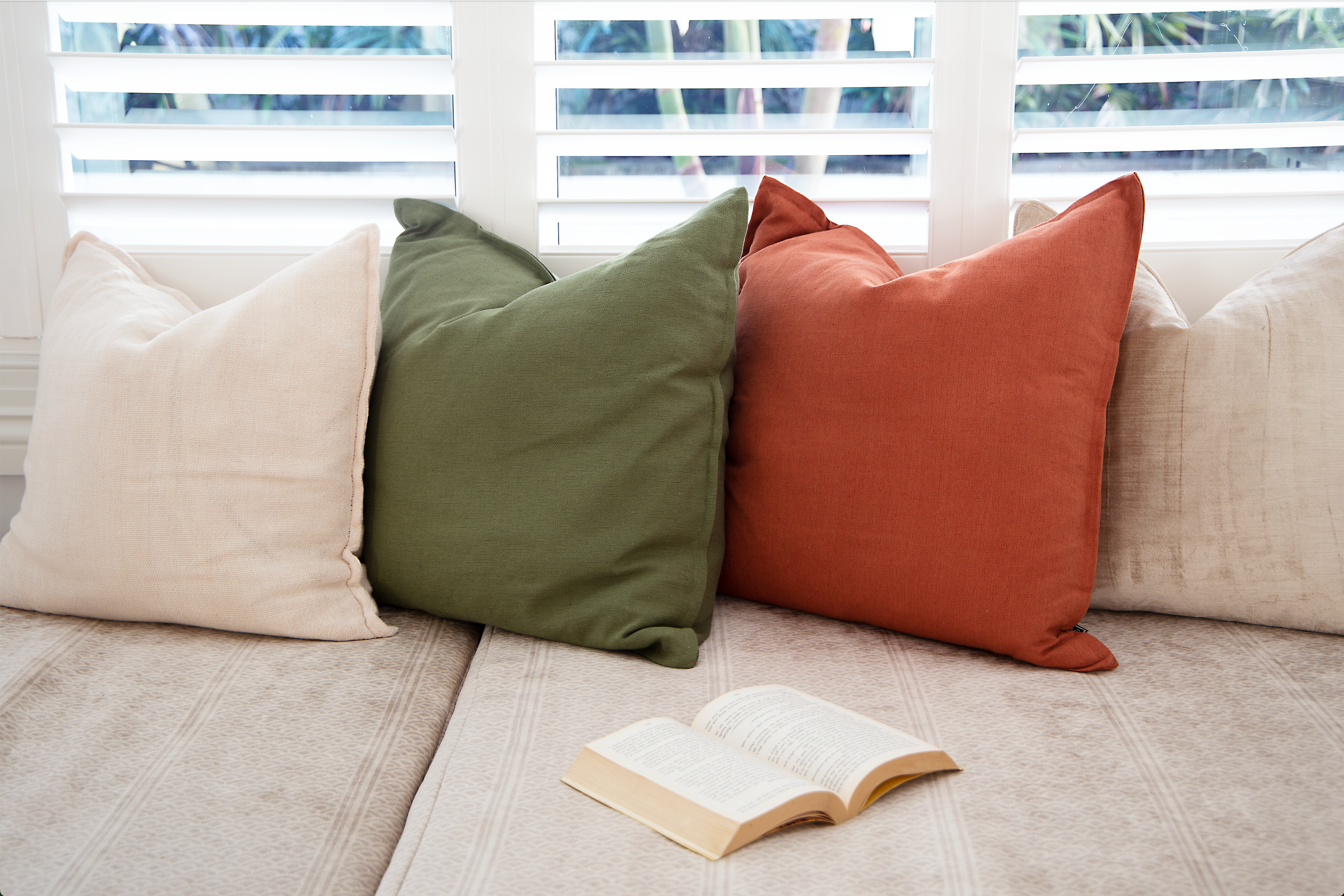
To marry the three colours to the space we have a few options available. The easy ones are the cushions and throws and even the lamp shades linking the colours. Other options may be ornaments, ottomans, vases, and even floral arrangements, again all reflecting the key colours of the room.
Remember when you’re tying in these three colours, link the original sofa or armchairs, through your soft furnishing décor items otherwise they will end up becoming the odd piece in the room. We need to bring them along on the journey too.
Also, be brave with mixing the fabrics and textures you’re adding but be a little careful with patterned fabrics. You can really add a wow when combining them with block colours, however too many florals or patterns will ‘fight’ with each other and create confusion.
Have fun and don’t be afraid to colour outside the lines.
Scaling the Heights of Interior Styling!
Scaling the Heights of Interior Styling!